Friday, 26 March 2010

AS FINAL PIECE;


Feedback:

Tori Douglas- "it's actually really good :| i like the start bit where it's someone sat outside & i like it how you linked the scenes together when you closed the curtains. & the bit where you're in the coffin looks really good:| proper" effective"

Sam Marsh- "Wow. That's ridiculously good! It looks professional from start to end I love the music, make up, costumes. The whole fact it looks like a professionally done piece is stunning. Well done you guys!! xx"

Joseff Revill- "WOW! That was pretty awesome guys, top job on creating the atmosphere with the right sound score, dim lighting and the tapping on the car wheel is really eerie and helps draw the audience in, really good, i shall give it 5 revels out of 5 and my own personal HURRAY!"

Callum Cook- "That was brilliant XD The neck crack bit was freaky lols, i really liked it, Id give it my own personal hurray!"

Emily Cross- "The music is chilling and goes very well with the scenes, the shots are very different lengths which shows variety in the video. The make up and imagery is life like and the blood on the face is realistic, also the plain white shirt for the pjs gives the sense of an innocent victim. Very good Video"

Boyce Pratt- "totally spooky"

Abigail Wells- "it was really good, good acting and use of sound and camera shots, really worked well together :) and the scene with the black and white pictures was really dramtic and captured what it was about"

Jenni-Leigh Seaton- "i <3ed>

Jenna Thomas- "media blog is amazing babe :O you;ve done really well"


Editing- Creating the Soundtrack using Garage Band;


Video showing some of the sounds used on our final piece.
www.freesound.org

Editing- iMovie;

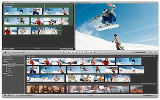
Imovie is the software used to edit our video into the final cut. The simple layout allows you to import music, sounds and video to apply to your video. Imovie can even change the presentation of your videos/images by changing the adjustments. The advantages of using Imovie means you can crop and delete audio/video by your demand. I found Imovie easy to use apart from one problem found with audio on on selection of the film. However this was easily resolved by separating the audio from that part. Imovie involves making new projects and then editing the video to your standard.

Editing- Garage Band;

Garage Band allows you to create unique sounds either to be applied to a film piece or simply to record a song. There are a range of music available and is listed into different genre which makes it easier to look for when you have a certain piece in mind. You can also import your own music which can be downloaded from sites such as www.freesound.org. From this piece of software, I then created 3 separate soundtracks for the film opening. Most of the soundtracks was a mixture of heavy beats, eerie tones and built up to the peak parts which matched parallel with actions within the piece.

Thursday, 25 March 2010

Images & Effects;

By using Adobe Photoshop you can adjust photo to your needs. There are a number of techniques you can use to change photos and these are some examples:

Vignetting; this technique often referred to as "fish eye lens" creates the illusion of what someone sees through their eyes. At post-production we used this idea with the webcam shot then the audience are seeing the female character from the stalkers point of view.

Posterize; Using this approach makes the image look distorted but artistically. You can change the strengths of Posterizing and if this image was stronger the picture would have a a smudging effect. Researching all different photo editing helped the group decide what would suit the montage coffin scene.

Invent; Changing a photo from positive to negative looks like the one posted above. Inventing gives the photo an eerie look. However, the outcome of the image depends on the depth and brightness surrounding it. This is the reason why Inventing was only used very briefly whilst editing because the use of bright lights during the coffin scene resulted in the female character barely visible.

Black and White; used mostly in Film Noir, Black and White makes the image look older than actually dated. This is a good technique when used to deceive an audience during the time scale of the opening piece.

These techniques can also be used on Imovie therefore practising on photoshop was great practice before the editing sessions began.

Wednesday, 24 March 2010

Typography- Researching Existing Fonts;

Typography- Existing Film Titles;

During filming we researched different film typography and compared them to their given genre.
This helped our group visualise how we wanted our film titles and credits to look like.


TOY STORY (1995)

This title is bold because of the heroic primary colours used to make it stand out. Similar to superheroes such as superman and wonder women, the colours red, yellow and blue represent fun and a happy ending. Behind the title is the background full of clouds which show the film can take you anywhere and escapism is guaranteed. Even the title "Toy Story" identifies that the films target audience is children because their daily life is based around bringing toys to life as entertainment.

The Bourne Identity (2002)

The Bourne Identity title shows straight away that the film is based around one character. Jason Bourne is shown with serious facial expressions next to screen shots of the film where he appears to be violently fighting another character. Bourne has been circled as a target on the title representing that the film could be based around someone hunting Jason Bourne however the reason isn't revealed. This is already triggering an enigma and gets the audience involved. Ironically even though the colours used (yellow and blue) are supposedly heroic it is unable to determine what side his character represents. The white, bold title stands out from its dark background making the target audience see his role in the film is crucial to the plot.

Star Wars: Episode Three - Revenge of the Sith (2005)

The audience can guess the genre of Sci-fi due to the out of space background with the dark galaxy and endless stars. Using Roman numerals to show which episode this Star Wars film is ranked, it is clear that this film is as big as space luring audiences to think this could be "out of this world". Each title is in a different colour such as "revenge of the sith" is a mix between red and white to represent heaven and hell showing there is a fine line between evil and good. The title enrols the plot without the audience noticing at first. "Star Wars" in gold implies the film is only of good quality, even by the shiny, capital writing. Within "Star Wars" the waves of sand suggest the film may flashback to prequels and sequels to draw the film together as a whole. This is a good tactic to attract the old and new generation fans of the world-wide known franchise.

Pulp Fiction (1994)

The simple idea of a black background and bold titles enforces an audience to make up their own plot. The title alone uses bright and bold colours to attract people but even the name "pulp fiction" forces people to think what the film may be about. Using the plain black background makes the title look authentic and comic.

Harry Potter and the Order of the Phoenix (2007)

The title is almost hidden by using all of the same colour but just changing the brightness and contrast between the background and the title. Harry Potter and the Order of the Phoenix appears in front of clouds to suggest the film is forever changing similar to the weather. Harry Potter also has a scar in the shape of a lightening bolt which is included in the typography when you look directly at the letter P. Each individual letter of "Harry Potter" has sharp edges implying what his character may be like in the film. The dark use of colour represent the darkness and sin within the film.

Final Destination (2000)

Final Destination uses small lettering to reassure the enigma of the film is revealed in small steps up to the big finale. It is believe that once we die we go to heaven and by using the stars as a background it suggest this film already ends in tragedy. The title "Final Destination" is distorted and uses white font to look similar to the stars. The background and title connote each other because they both show the film will be tragic due to the destination being death.

Clash of the Titans (2010)

Clash of the Titans uses strong gold bold typography to connote the films plot which shows the fight between Zeus and Hades. The mixes of browns in the background imply the fight will be dark and sinister involving violence from the clouds. The typography uses straight lines in the font to put across how strong the titans are within the story. Gold titles imply this film is worth seeing because of its quality.